For the 2026 Summer Solstice

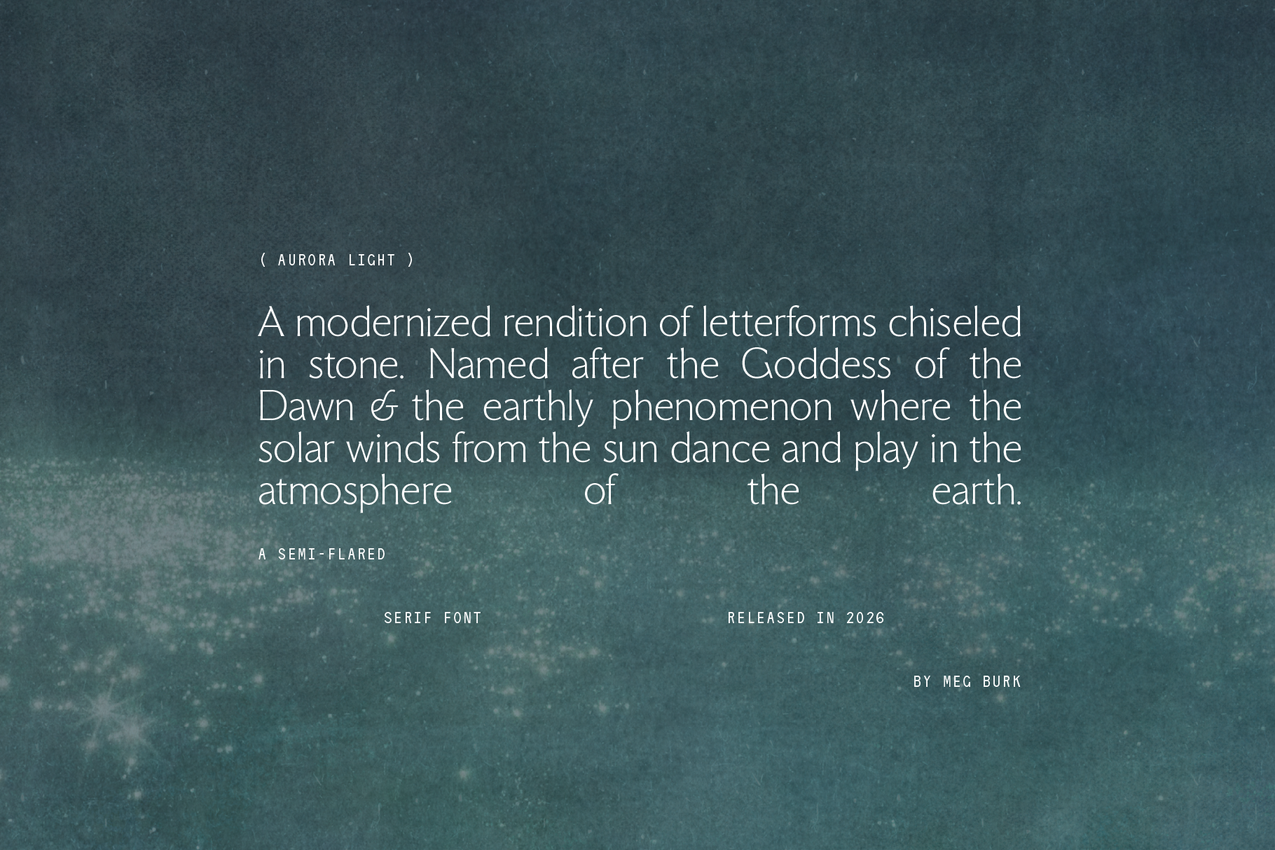
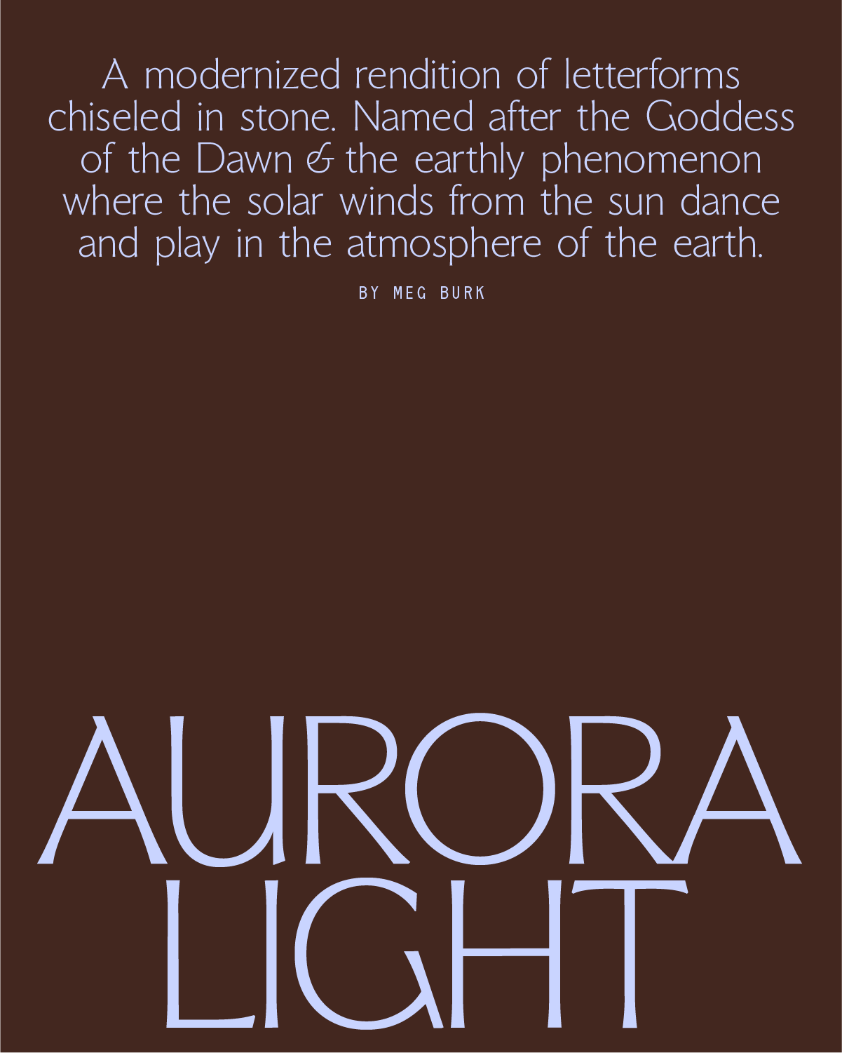
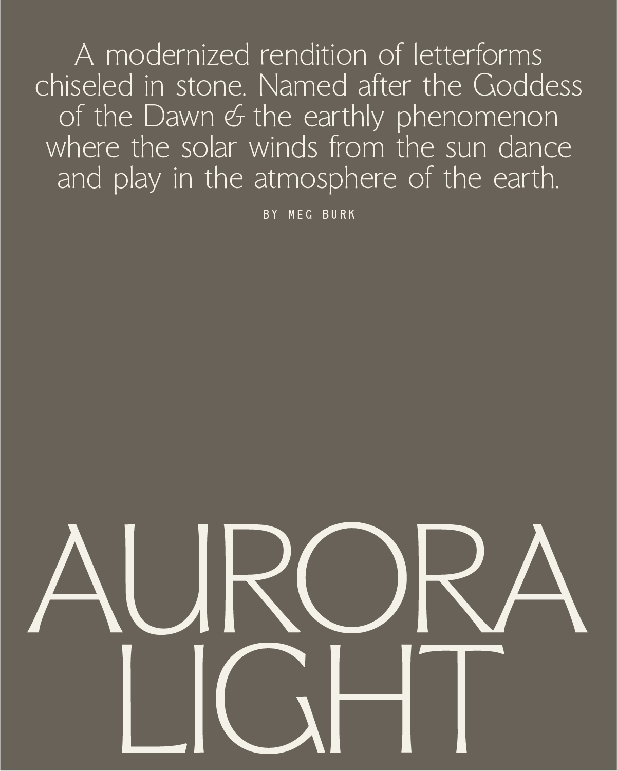
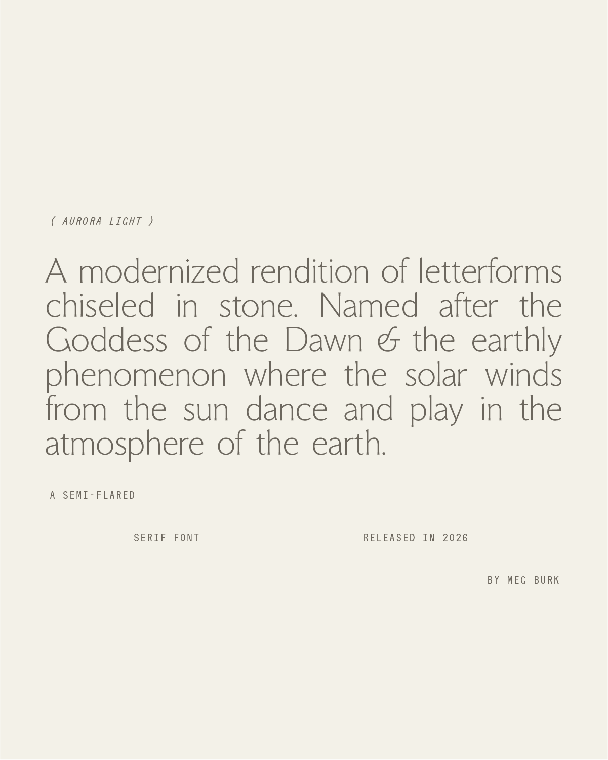
A modernized rendition of letterforms chiseled in stone. Named after the Goddess of the Dawn & the earthly phenomenon where the solar winds from the sun dance and play in the atmosphere of the earth.
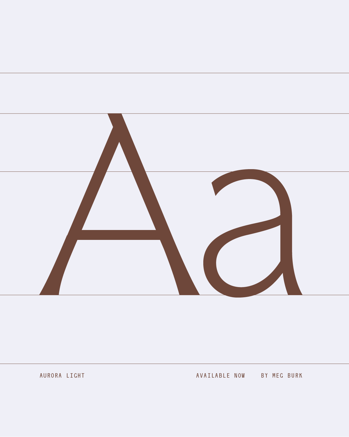
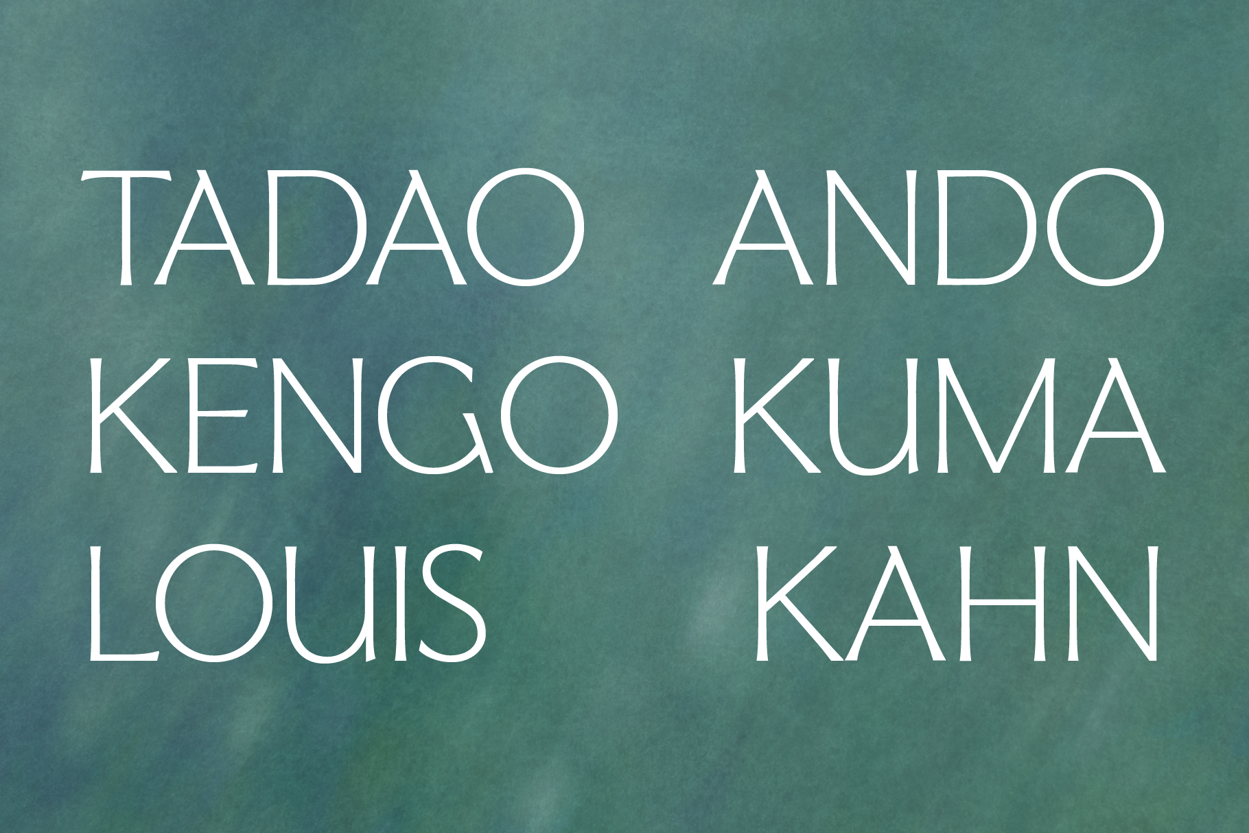
There's something delightful about the juxtaposition of rigidity and fluidity existing simultaneously. In this typeface, the regular style is a modernized approach to a classic Roman-style serif; of letterforms hewn in marble and other stones. But in the modern age, some designs call for accent font styles, and many Roman-styled fonts have no italics, or obliques. This is where I took the artistic liberty to design calligraphic italics to match the base font. A higher-than normal x-height brings the entire collection into a modern era. The confident flares serifs of the regular style are steady and assured, allowing the italics to add softness and a creative hand.
In naming and concepting this font, I was really drawn to the idea of the sun itself INTERACTING with earth, in a way. I explored
concepts of photosynthesis - how the plants fuel themselves on the sun's rays.
In my exploration, I thought about the Aurora Borealis (I do, after all, have a tattoo of them) - and how it is the sun, from so far away, dancing, playing, in the Earth's atmosphere. How their meeting is vibrant, colorful, and captivating.
This concept stuck. It's the intersection of two things, creating a unique and beautiful display.
May Aurora in its regular and italic forms delight your designs as much as humans delight in the colors of the Auroras.
More language support to follow this summer.