

Sweat, tears, and sunlight: how the making of a font mirrored my life experience.
A story of confidence and contrast: what being a creative human with goals feels like during a difficult year.
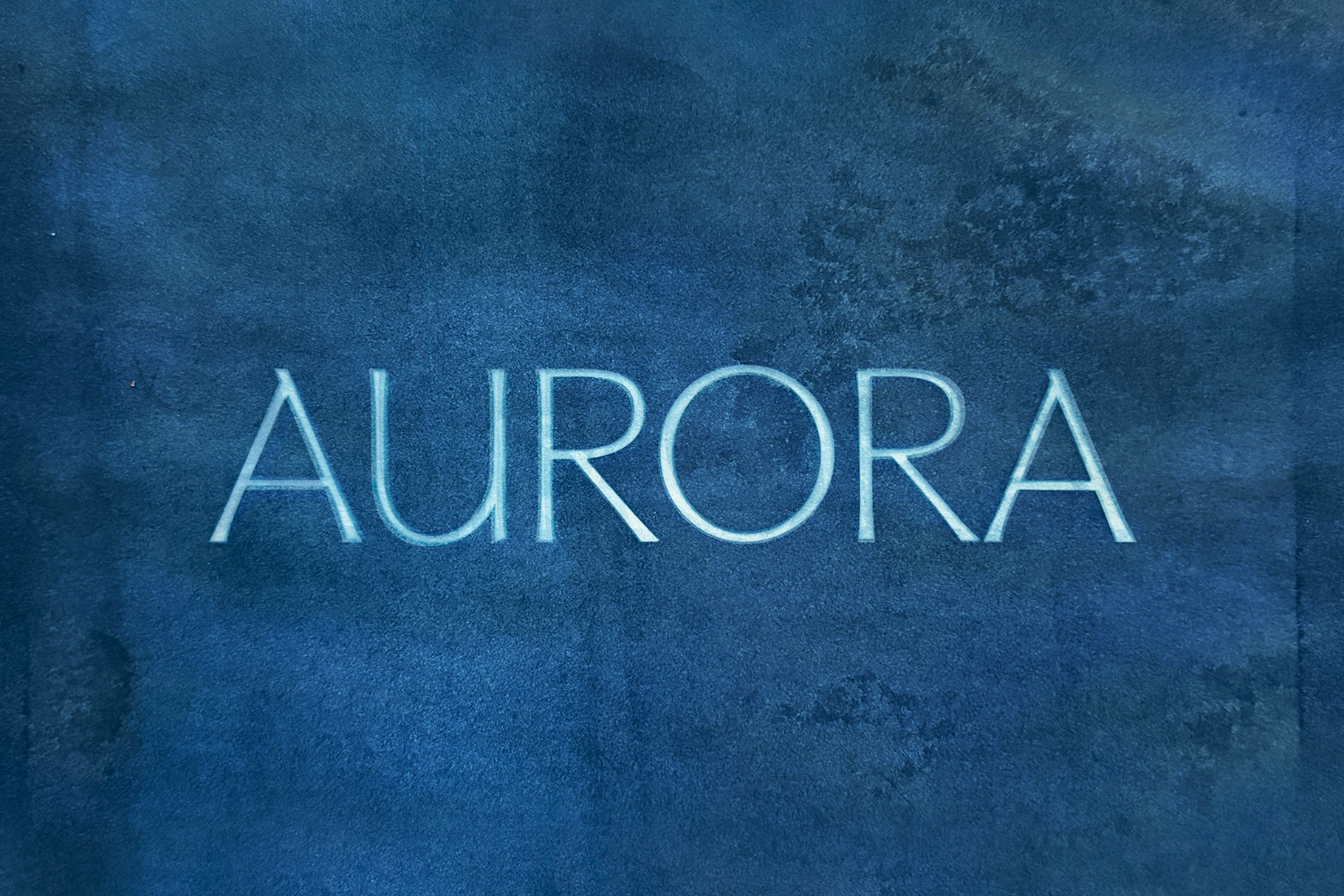
Every font I make is a telling of a human story — something rooted in curiosity, in experience, in the invisible threads that connect us across languages and millennia. Aurora is the most personal one yet…This is the story.
The last six months of my life have actually been some of the hardest I've had as an adult. I've been deep in wedding prep for a wedding my incredible fiancé and I planned and designed ourselves — of course it was double the budget we initially set and more work than we anticipated, but this is not the cause of my stress. The wedding planning ended up being the mirror that made me realize my stress was debilitating. Many say this is supposed to be the most joyous time of my life, and yet it seemed to be endlessly difficult. Money was tight, work inquiries were slow. I had difficult projects where the management of them ate up more bandwidth and time than I anticipated.
At the end of April, I had a mental breakdown — 24 hours of crying and sobbing and gasping for air. Life could not go on this way.
Through it all, I was still proud of this font, Aurora. I wanted to show it off in the best light. After some time to recoup emotionally, I decided to focus on the marketing. The story hadn't unveiled itself to me yet.
What I discovered was that the hardship and growth from the last six months was infused in the vectors all along.
This font is a story of the contrast between chiseled stone letters and inky handwritten letters on parchment. Both so human — one ephemeral and one extremely permanent.
When I designed Aurora, I designed the regular style to feel like a modernized Roman serif. It needed to feel regal, confident, and refreshing — a pairing suited for fashion brands, architecture firms, creative directors, and beyond.
For the italics, I wanted the juxtaposition of a fluid calligraphic style. A simple oblique wouldn't cut it. Too expected. Too rigid. Instead, curved, handmade lines add a soft juxtaposition.
This is a font family built to tell stories of humanity's contradictions.
To tell the story, I decided it needed to be about how the Earth and the sun interact — how the sun can play with the Earth and impact the lives of the humans on this planet. It's the story of the auroras: the sun's rays and electrons playing in the Earth's atmosphere, creating a dancing light show of vibrant colors. It just works out that the Roman goddess of the dawn is Aurora.
Sun rays touching our skin and dancing in our atmosphere are phenomena that tie humans together across languages and millennia.
Cyanotype was the perfect way to display this font in a way that is unexpected and, hopefully, incredibly refreshing. In collaboration with the sun, I crafted the marketing images. I painted cyanotype formula on paper and laid it out in the sun with Aurora's letterforms overlaid via a transparency printed at Office Depot.
The mirror of my personal development during this time is that Texas was going through an unusually rainy year. This rainy season meant that many times I had meant to film and create the marketing materials, I was thwarted by overcast days — unable to make them as early as I'd liked. I was encroaching on my deadline: the summer solstice. I wanted to release this font on the summer solstice. I hadn't finished all of the language support yet, and I hadn't been able to make the marketing materials. The feeling bubbled up again: I felt stupid, or incapable, or like I just didn't have it in the cards this year to achieve the things I had dreamt of achieving.
And somehow the story became not about the sun and the humans, not about storytelling and letterforms and mark-making over generations. It became a story of embodying presence in the moment — a relinquishing of goals that had become jail cells.
The last few months have forced me to live more in the moment, to relax, to lay in the sun when it does come out for a few minutes instead of burning my eyes at a screen until 10 PM.
I know many of us — at least in the Texas area — have had our own emotional journeys this year, especially during this rainy season. So many of us are impacted by overcast days affecting our moods. So many of us are going through a hard time financially while looking around and seeing others in luxurious abundance.
Contrast and comparison can be beautiful, and they can also be a mental jail cell.
I now choose to create rather than to scroll, and to pursue my dreams with less control and a slower pace.
After all, by the time this is published, I will have been married. And I've decided that the most beautiful thing a human can experience is love, community, and connection to others.
Aurora has come full circle. At its core it was meant to be a stylistic vehicle for communication — what you say will feel a little different when typed from one font to the next. May what you want to say be authentically represented when you use the font. May it allow you to connect with others, to feel calm and present and aligned, creative, capable, and abundant.
I hope you design with it and feel a spark of creativity, some inspiration, and a desire to go feel the sun on your own skin.
And if the sun is not out, make the most of that, too.
Warmly,
Meghan